Bar Line Combo
A Bar Line Combo chart combines the features of a Bar chart and a Line chart. With this visualization, you can show data from two different columns on the Y-axis. These metrics, clubbed together on a single visualization, help you discover additional insights.
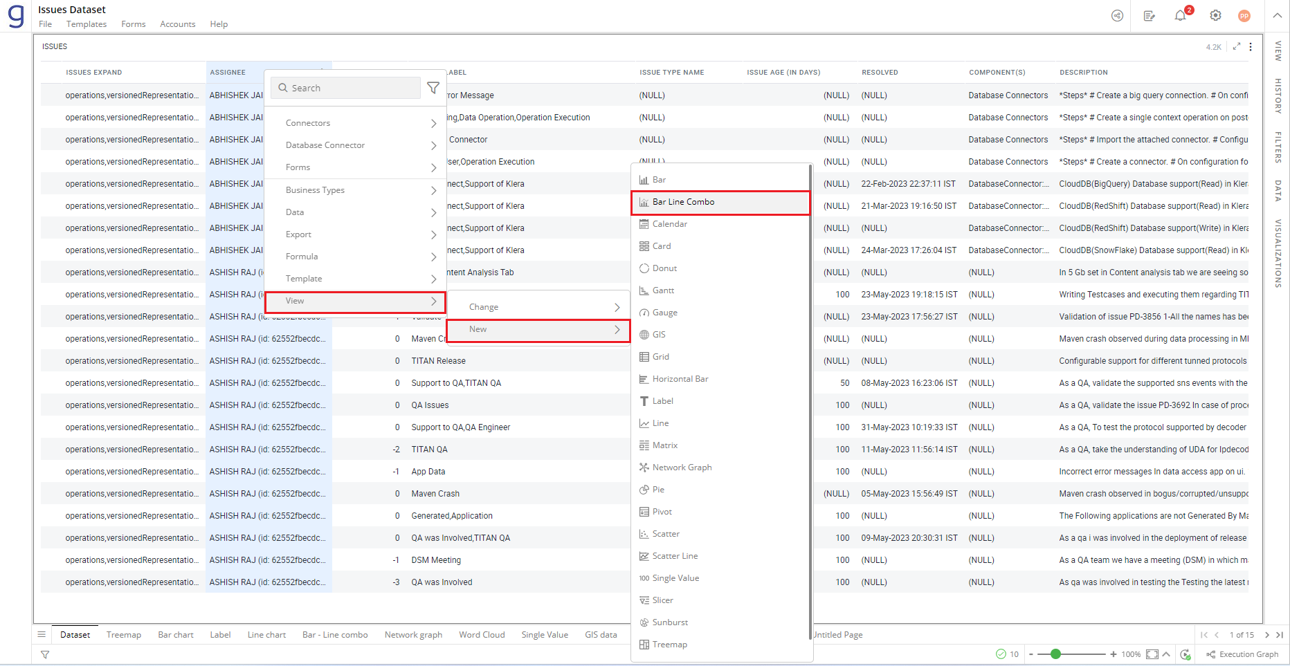
In the example below, a Bar Line Combo chart is created to compare issue allocation and resolution across assignees.
To create a Bar Line Combo chart:
- Right-click on the Assignee column > Select View> Change> Bar Line Combo.
Refer here to learn more about creating a visualization.
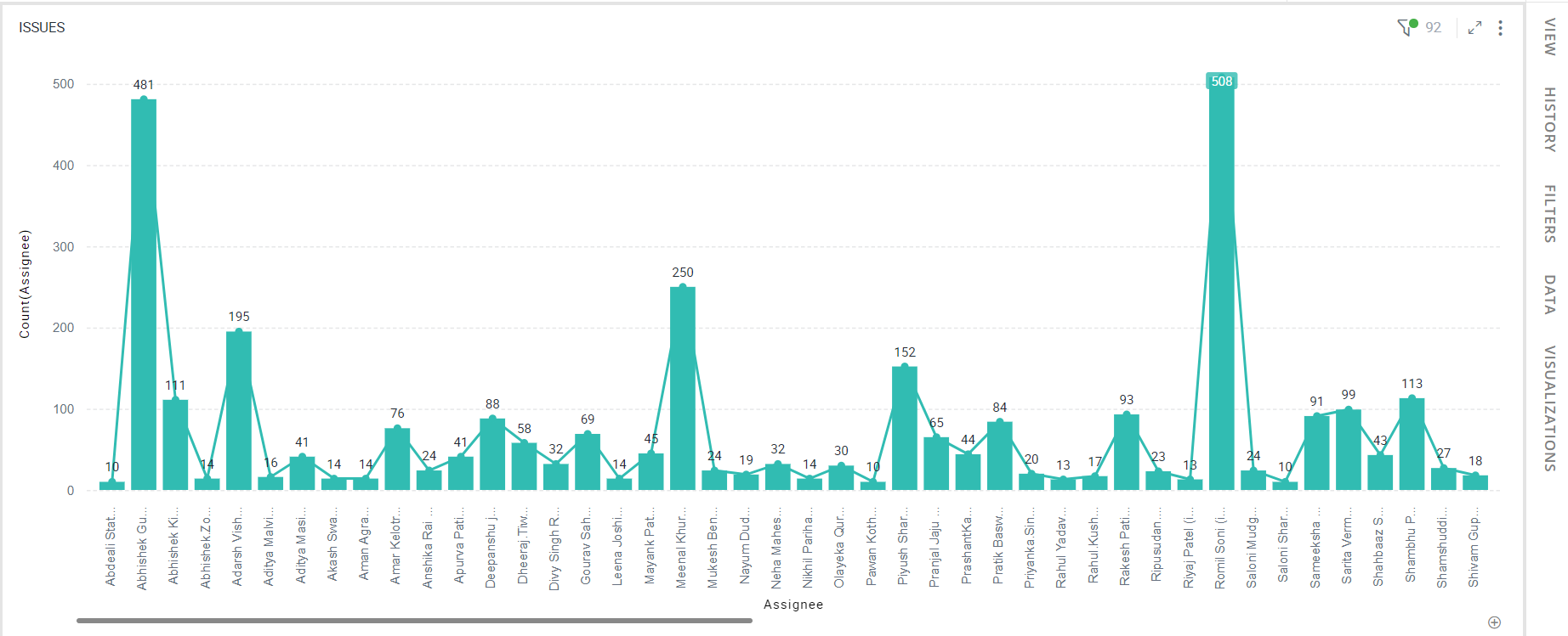
The following figure shows the resulting Bar Line Combo chart.
Configure Bar Line Combo Chart
- Select your Bar Line Combo chart and open the Visualizations Panel.
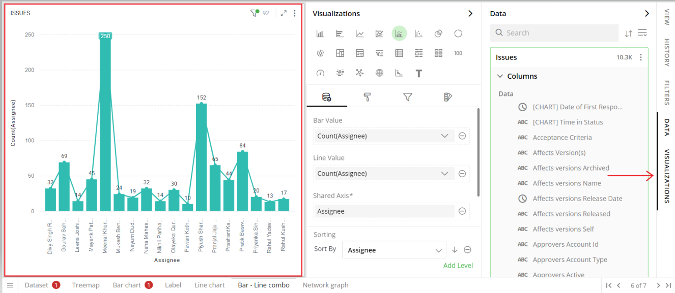
The following configuration options are available for Bar Line Combo chart:
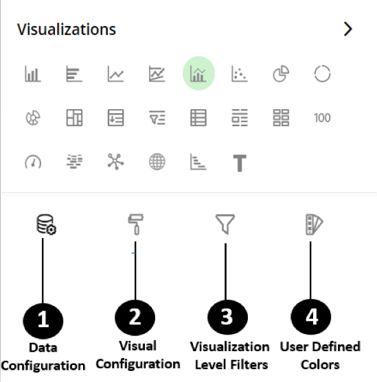
Data Configuration
 : It lets you choose columns for the following settings:
Bar Value
Line Value
Shared Axis
Color Saturation
Sorting
View Configuration
 : It lets you configure the visual appearances and interactions of the Bar Line Combo chart.
Labels
Bar Options
Lines
X-Axis
Y-Axis
Zoom
Legend
Container Settings
Visual Interactions
Visualization Level Filters
 : It lets you filter the data in the visualization without impacting other visualizations on the same data set.
Refer here to learn more about Visualization Level Filters.
User-Defined Colors
 : It lets you add meaning to a data point by associating a specific color to it or, differentiate a data point from the rest.
Colors Individual Data Item
Color Saturation
Data Configuration
Click icon for data configuration options.
Bar Value
Specify the column whose values should be aggregated, as per the categories, to create bars.
To change the column:
Click on
 to remove the existing column.
From the Data Panel, drag the desired column and drop it onto the Visualizations Panel’s “Bar Value” section.
Note: You can also searchthe column name in the Data Panel to quickly find it.
Click on the
 icon to select the aggregate function from the drop-down.
Aggregate functions for textual data: Count, Unique Count
Aggregate functions for numerical data: Count, Unique Count, Sum, Min, Max, Avg
You can add multiple columns to the Bar Value to create a stacked or grouped Bar chart.
You need to separately select aggregate functions for each column in the Bar Value section, as explained above.
Refer here to learn more about the stacked and grouped Bar charts.
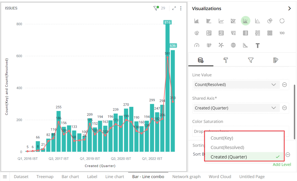
Line Value
Here, you can specify the column whose values should be aggregated for the chosen categories to create lines.
To change the column:
Follow the same steps as shown above for “Bar Value”.
You can add multiple columns to the Line Value to create a multi-line chart.
You need to separately select aggregate functions for each of the multiple columns added to the Line Value section, as explained above.
Shared Axis
On the Shared Axis, you can specify the column which contains specific categories to be compared.
To change the column on Shared Axis:
Click on
to remove the existing column.From the Data Panel, drag the desired column and drop it onto the Visualizations Panel’s “Shared Axis” section.
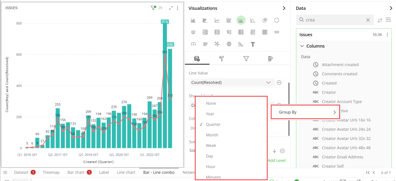
Date and Time Grouping on Shared Axis
You can create Bar charts by setting date and time values on Shared Axis. When specifying a column with date and time on Shared Axis, you can group the dates by year, quarter, month, week, day, hour and minutes.
- From the Data Panel, drag the Date, DateTime and Time type column and drop it onto the Visualizations Panel’s “Shared Axis” section.
- Click on the
 icon and select ‘Group By’ .
 - Select the appropriate interval.
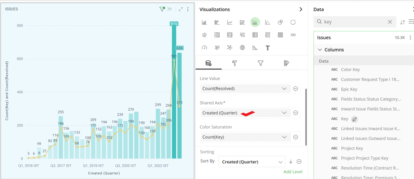
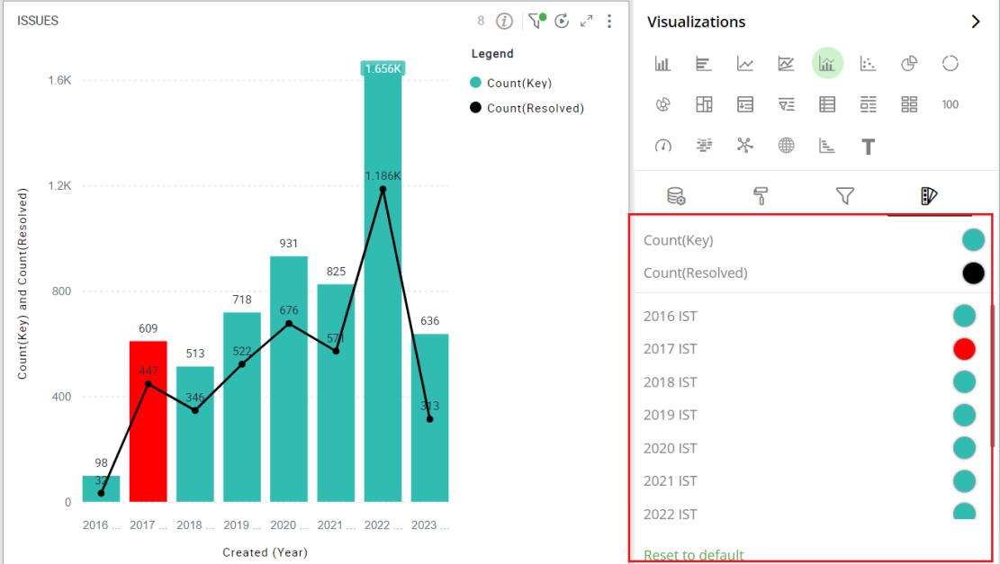
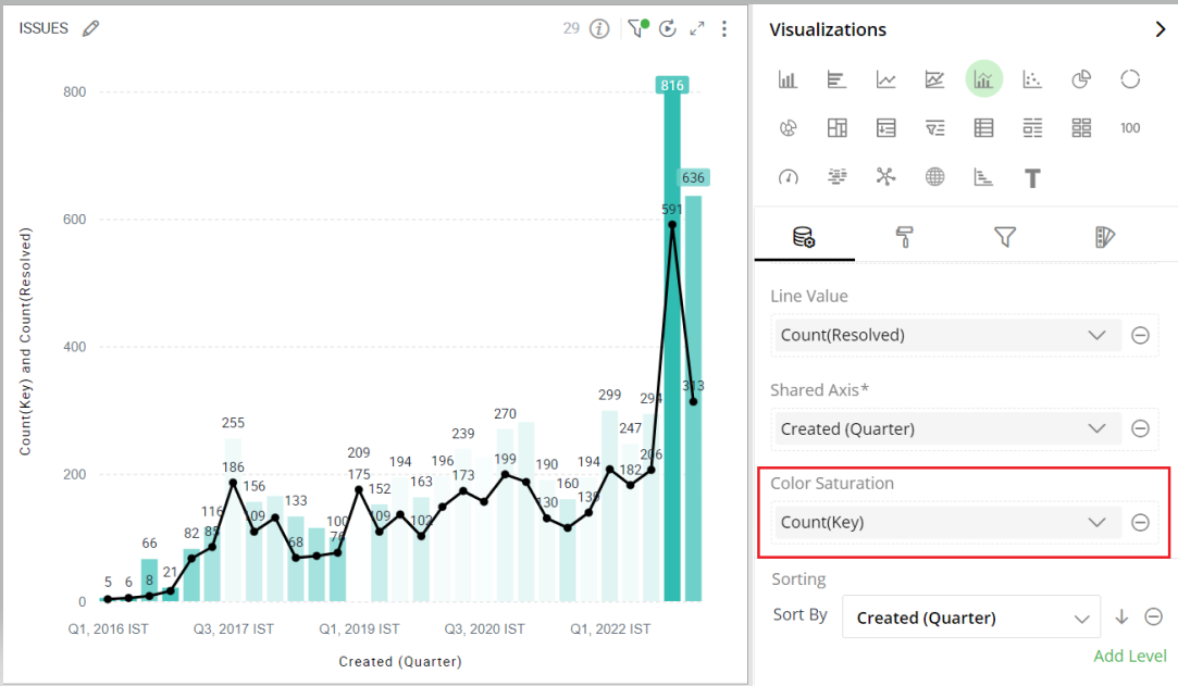
For Bar Value and Line Value, let’s take ‘Key’ column and ‘Resolved’ column respectively. Select ‘Count’ aggregate function to find out the total number of issues created and resolved. Similarly, drag and drop the issue creation date- ‘Created’ column to the Shared Axis and group the data by ‘Quarter’. The changes are shown in the image below. This enables you to compare the number of issues allocated vs resolved issues over a time period.
To learn more about Date & Time grouping, refer to the following GIF.
Note: Steps for sorting are same for Bar and Bar Line Combo chart.

Color Saturation
You can use color gradients to show the progression of data from high to low values. Each bar will be colored with a shade from the spectrum between the two colors defined as ‘Minimum’ and ‘Maximum’.
To apply color gradients:
Drag the desired column from the Data Panel and drop it on the Visualizations Panel’s “Color Saturation” section.
Select the aggregate function by clicking on the
icon.
In this example, the Bar Line Combo chart reflects the gradient with light colors for low values and dark colors for high values calculated as Count (Key).
To customize the shades of color saturation, refer to section- ‘Color Saturation Settings’.
Sorting
You can sort the Bar Line Combo chart based on the values of Shared Axis or Bar Value or Line Value.
Note: By default, the Bar Line Combo chart is sorted by the values shown on Shared Axis.
To change the sorting order:
- Click on
 icon and select the column from the dropdown.
Click on
 or
or  icon to select the sorting order (ascending or descending).
Click on ‘Add Level’ to add more columns for multi-level sorting.
Drag and drop columns within the sorting section to reorder the sort levels.
Click on the
icon to remove the sorting level.
To learn more about sorting, refer to the following GIF.
Note: Steps for sorting are same for Grid and Bar Line Combo chart.

Sorting GIF from GRID
Visual Configuration
- Click the icon for visual configuration settings.
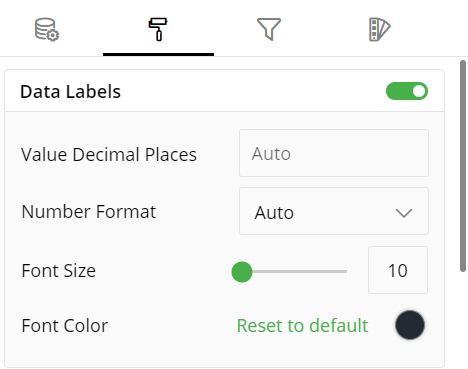
Data Labels
You can hide or show the data labels by this toggle switch.
Provide the font size of data labels.
Click on the color picker icon and select a font color from the color grid. To restore the default color setting, click ‘Reset to Default’.
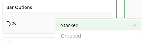
Bar Options
Bar charts have two variations-
Grouped
Stacked
They can be really useful to display information about the sub-groups that make up the different categories. These are usually colored differently which makes it easy to distinguish between sub-groups.
- Click on the arrow
 icon to see the options for Bar chart type.
Stacked Bar Chart
In Stacked Bar charts, the bars representing the sub-groups are placed on top of each other to make a single column. They are great for showing the total value because they visually aggregate all of the categories in a group.
Here is the Stacked Bar chart:
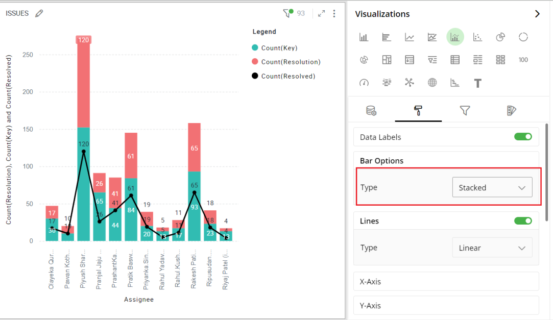
Stacked bar line combo
Grouped Bar Chart
In Grouped Bar charts, a separate bar represents each sub-group (e.g. Issue types). They are useful when you want to see each element in different categories or compare elements across categories.
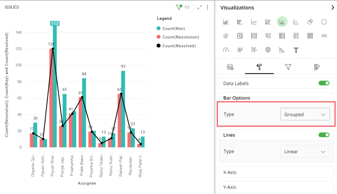
Grouped bar line combo
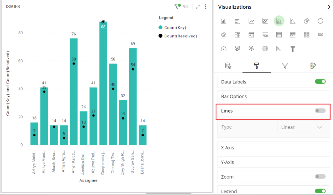
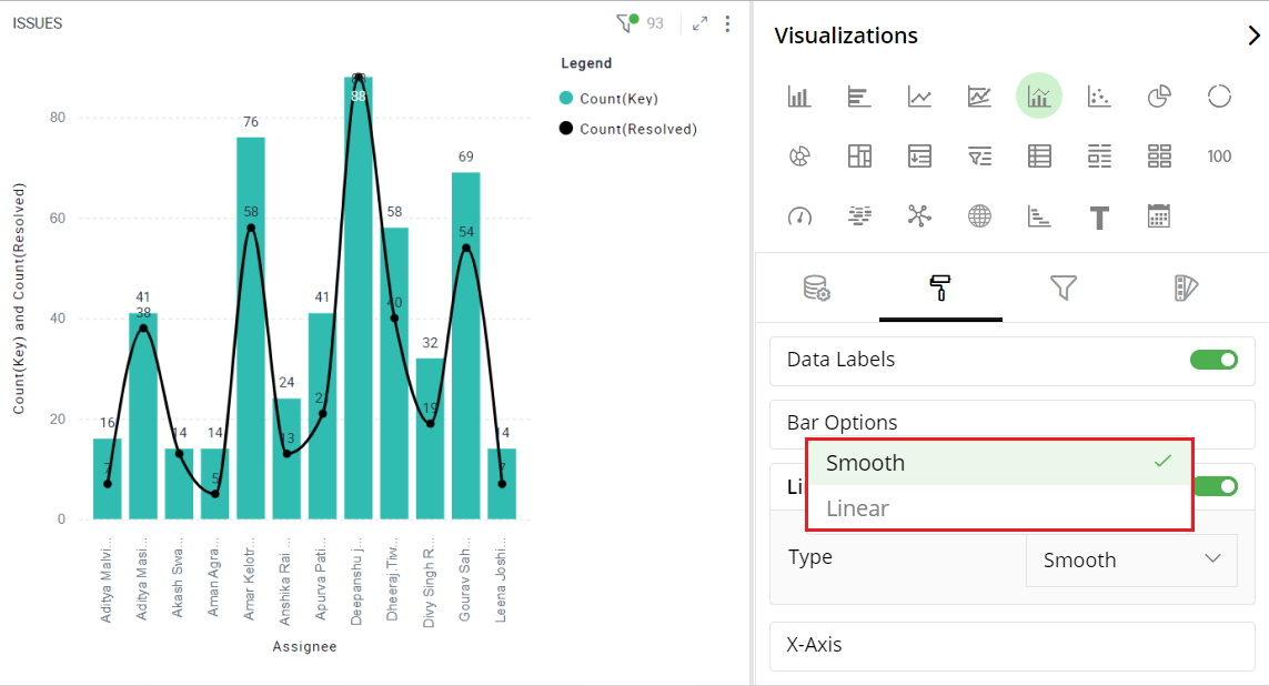
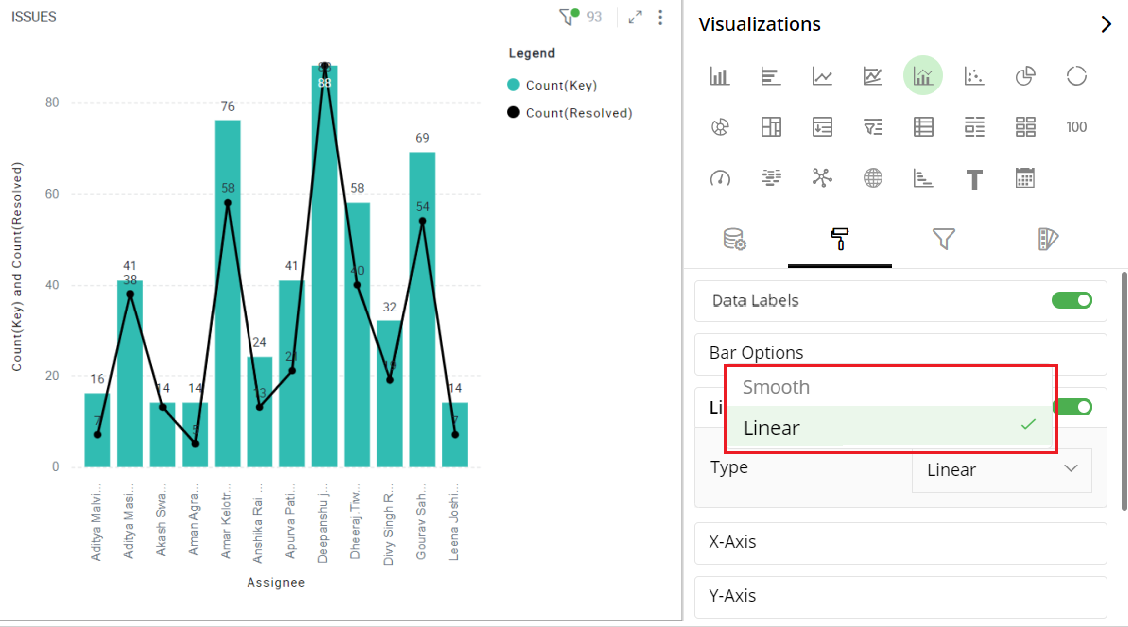
Line Style
To turn lines selection on or off:
Select the toggle switch.
Choose between Linear and Smooth line style.
The following example shows the visualization with no lines.
If you choose to have smooth lines, then your chart will look like this-
With linear lines, your chart will look like this-
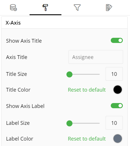
X-Axis
- Type in the title for X-Axis.
Y-Axis
Choose the number of decimal places you want to display values with.
Select the Axis type.
Type in the Axis title.
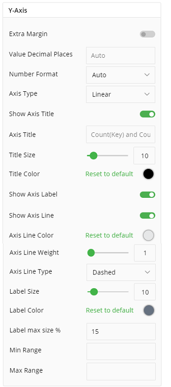
Axis Types
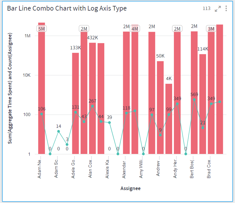
There are two ways to plot values in a Bar chart - linear and logarithmic.
On a linear scale, a change between two values is perceived on the basis of the difference between the values, whereas, on a logarithmic scale, this change is perceived on the basis of the ratio of the two values.
The main reason to use logarithmic scales in charts and graphs is to respond to skewness towards larger values; i.e., cases in which one or a few points are much larger than the bulk of the data.
When plotting disparate data on a linear scale, the smaller values get lesser prominence while the larger ones occupy the entire scale. In such cases, using a logarithmic Axis type is recommended.
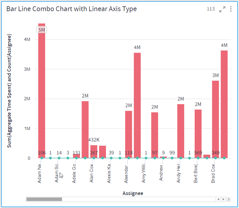
The following figures demonstrate the Bar Line Combo charts with linear and log axis types, created for the same data.
Bar Line Combo chart on the linear axis:
Bar Line Combo chart on the logarithmic axis:
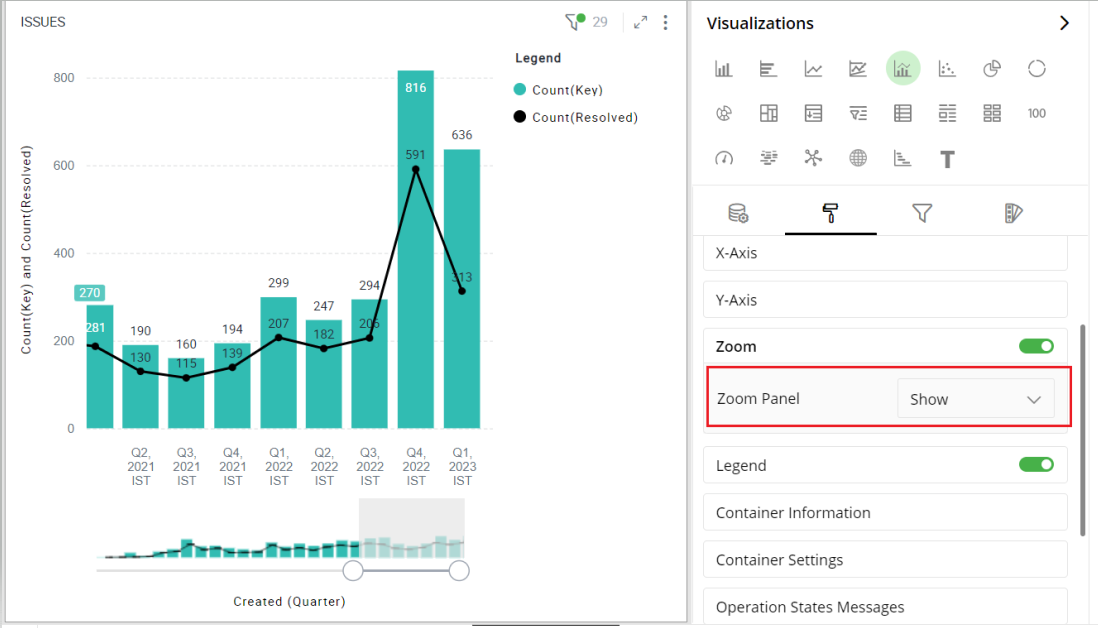
Zoom Option
This option enables you to clearly understand specific data in your Bar Line Combo chart by zooming it.
Keep the Zoom Option ‘On’ by selecting the toggle switch.
For the Zoom Panel, select the ‘Show’ option from the drop-down list to select the part of your chart by dragging its edges in either direction.
Select the ‘Hide’ option from the drop-down list to hide the Zoom Panel.
Here is an illustration.
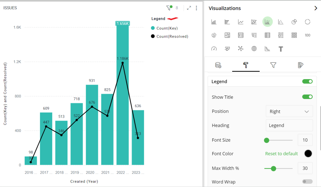
Legend
Legend helps you identify and correlate data on your chart. They provide an overview of the different data points involved in the chart along with the colors associated with each of them. Legend consists of Heading and Items.
To turn legends on or off, select the toggle switch next to Legend.
Select legend position (Left, Right).
Enter text for the legend heading.
Move the slider or provide the value for font size and Max Width in %.
Click on the color and select a Font color from the color grid. To restore the default color setting, click ‘Reset to Default’.
To turn Word Wrap on or off, select the toggle switch.
Note: Click on legend items and related data will be highlighted in the visualization.
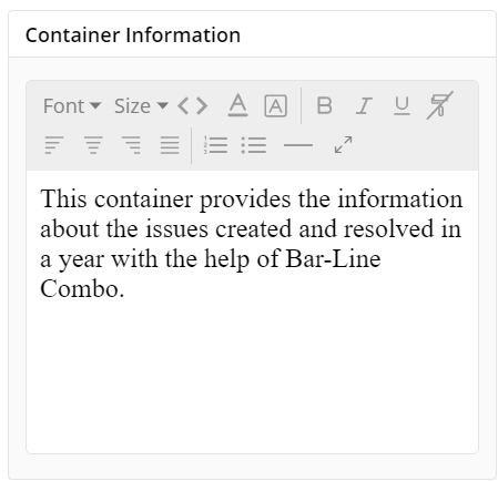
Container Information
You can enter the details of a container in the Container information and change its Font, Size, Color, etc.
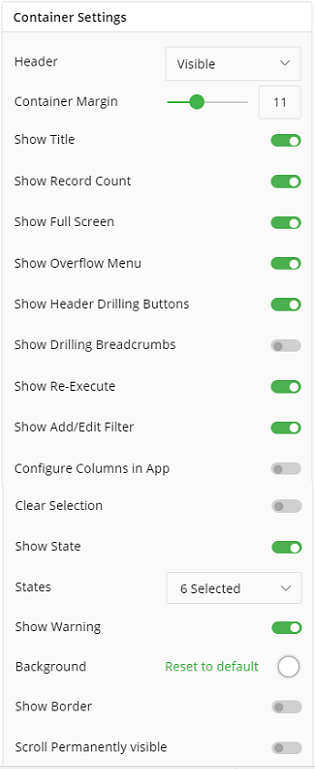
Container Settings
- Change the container Settings for the following fields such as Header, Container Margin, Container Margin, etc. as per your requirements.
- To show Record Count, Full Screen, Re-Execute, etc. click the toggle switch.
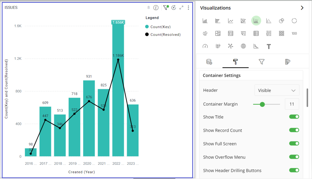
The following figure displays the effect of various container settings for your Bar chart.
Operation States Messages
Add/edit the Operation States Messages such as Waiting message, Waiting details, Processing message, etc. to provide a concise information about operation states.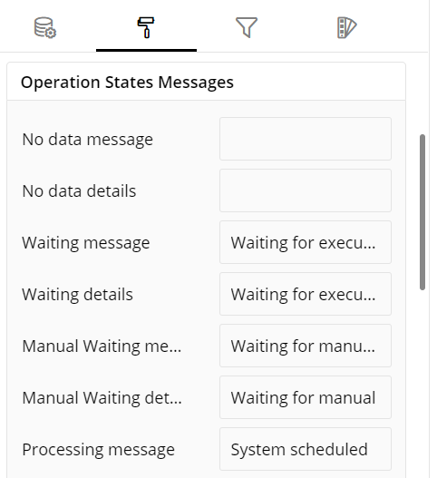
Formulae States Messages
Add/edit the States Messages such as Waiting message, Waiting details, Processing message, etc. to provide a concise information about Formulae states.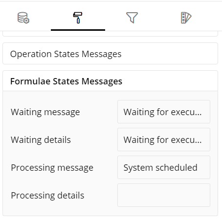
Refresh Rate
Select the Refresh Rate such as Low, Medium, High resolution to display updates in your application.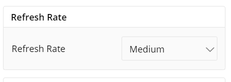
Visual Interactions
- Select the target behavior and coordinated visualization scope from the below settings.
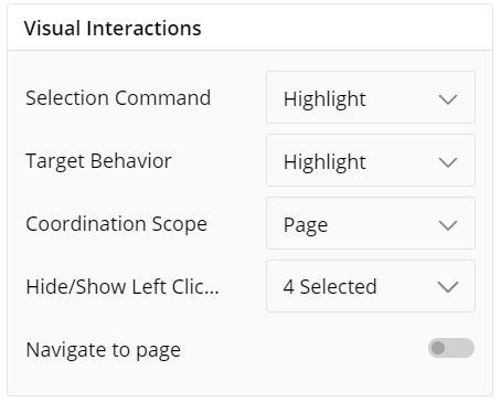
To learn more, refer to section- ‘Configure Coordinated Visualization’.
User-Defined Colors
- Click on the
 icon for user-defined colors.
Colors for Individual Data Item
It lets you add meaning to a data item by associating a specific color to it and differentiate some data items from the rest.
For example, the red and green color may be used to represent “Off Track” and “On Track” issues, respectively. Whereas, orange color may be used for the “Bugs” type of issues to draw attention.
To change the colors:
Click on the color picker next to the data item for which you want to change the color.
Select the color from the available color grid or click ‘More Colors’ to choose a color from the spectrum.
To restore default settings, click on ‘Reset to default’.
As shown below, orange color has been added to differentiate that data item from the rest.
If ‘Color Saturation’ is not selected, you can choose the color for your visualization as shown in the following figure:
Color Saturation Settings
The following figure shows the default color saturation settings for your visualization.
To customize the color gradient effects:
Select the Minimum and Maximum color.
Toggle ‘Diverging’ option. An additional color selector for mid-range value, called Center, appears.
Select the color ‘Center’.
You can provide custom values representing ‘Minimum’, ‘Center’, ‘Maximum’ Values. All bars larger than ‘Max Value’ are colored in ‘Max Color’ whereas those less than ‘Min Value’ in ‘Min Color’.
To learn more about color saturation settings, refer to the following GIF.
Note: Steps for color saturation settings are same for Bar and Bar Line Combo chart.
 Color saturation GIF
Configuration Options in Full-Screen Mode
Visualization can be seen in full-screen mode by clicking on  icon.
icon.
Note: Visualizations Panel is not accessible in full-screen mode.
Click on the
 icon at the top-right corner of the container.
Select ‘Configure View’ from the overflow menu.
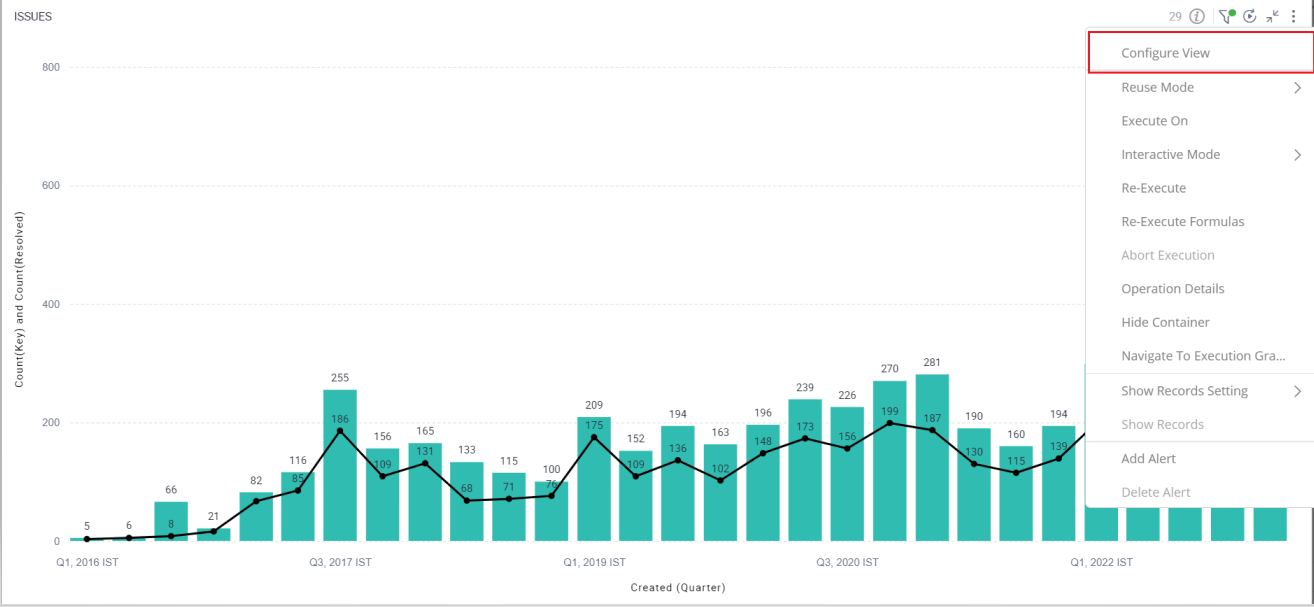
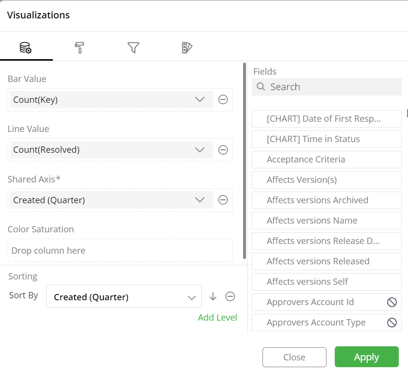
A pop-up form with all the relevant configuration options will appear on the screen.
Configure your Visualization and click on ‘Apply’.
If you have any feedback on Gathr documentation, please email us!