GIS Visualization
GIS is a visualization that displays the data in Geographical Information System. It uses data that is attached to a unique location. GIS is a computer-based tool used to store, visualize, and interpret geographic data that identifies the geographic location of features with the help of Latitude and Longitude data.
In the example below, GIS is created with “Latitude and Longitude” as columns, to analyse Global data.
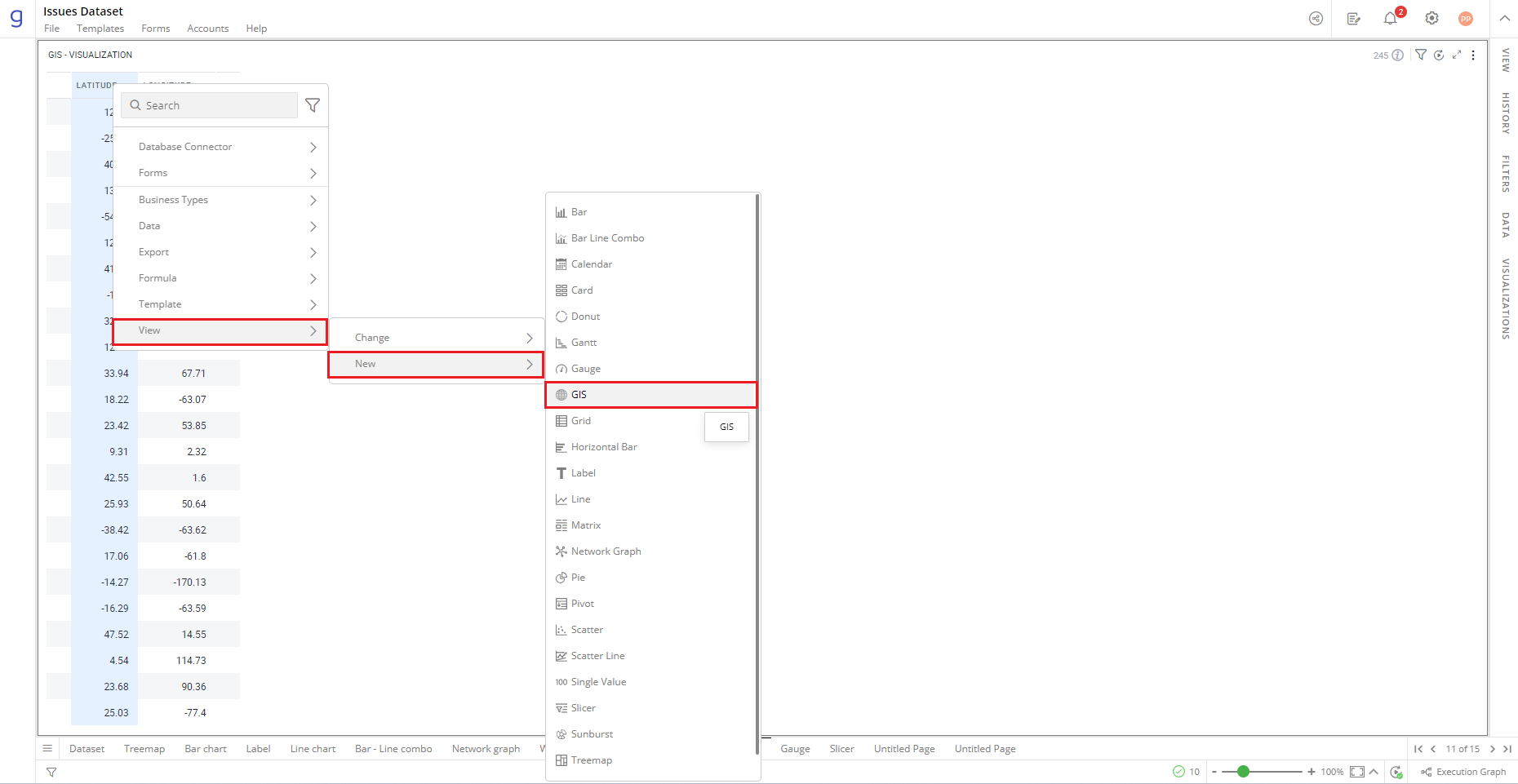
To create a GIS
- Right-click on the ‘Component(s)’ column > Select View> Change>GIS.
Refer here to learn more about creating a visualization.
The following figure shows the resulting GIS: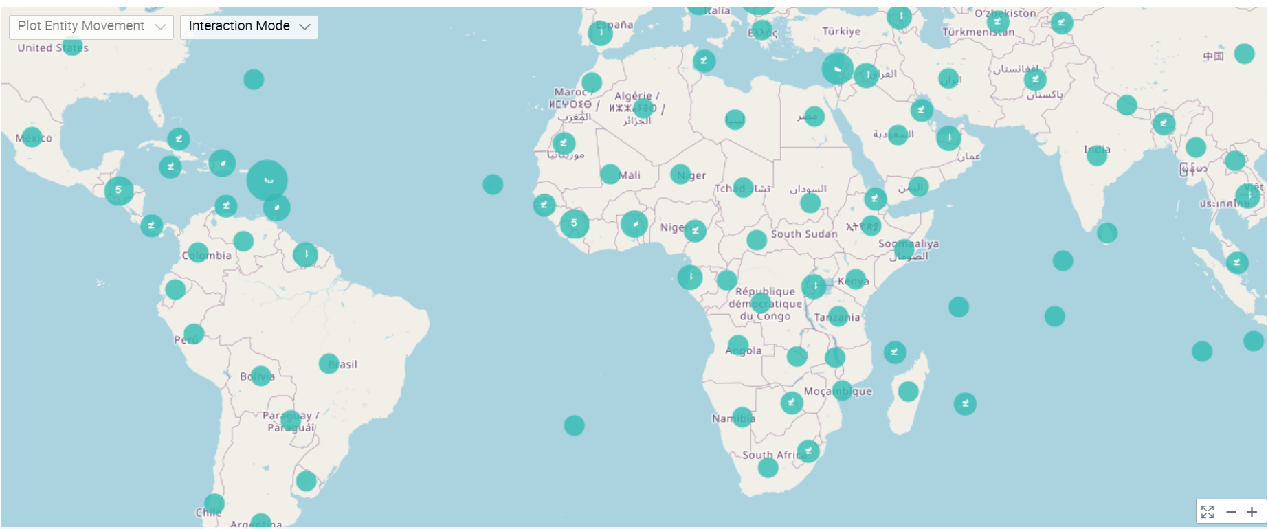
Configure GIS
- Select your GIS and open the Visualizations Panel.
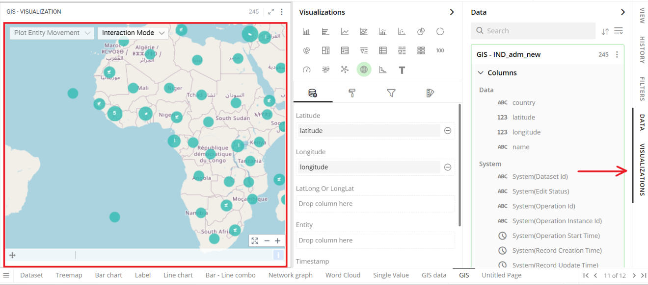
The following configuration options are available for GIS: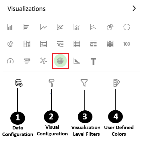
Data Configuration
 : It lets you choose columns for the following settings:
View Configuration
 : It lets you configure the visual appearances and interactions of the GIS.
Visualization Level Filters
 : It lets you filter the data in the specific visualization without impacting other visualizations.
Refer here to learn more about Visualization Level Filters.
User-Defined Colors
 : It lets you add meaning to a data point by associating a specific color to it or differentiate a data point from the rest.
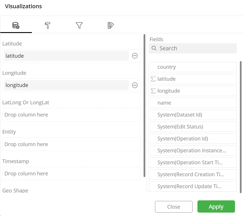
Data Configuration
- Click
 icon for data configuration options.
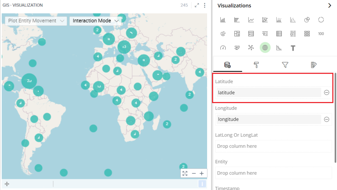
Latitude
You can specify the column to be displayed as Latitude in GIS.
To change the column:
Click on the
 icon to remove the existing column.
Drag the desired column from the Data Panel and drop it onto the Visualizations Panel’s “Latitude” section.
Note: You can also type the column name in the Data Panel to quickly find it.
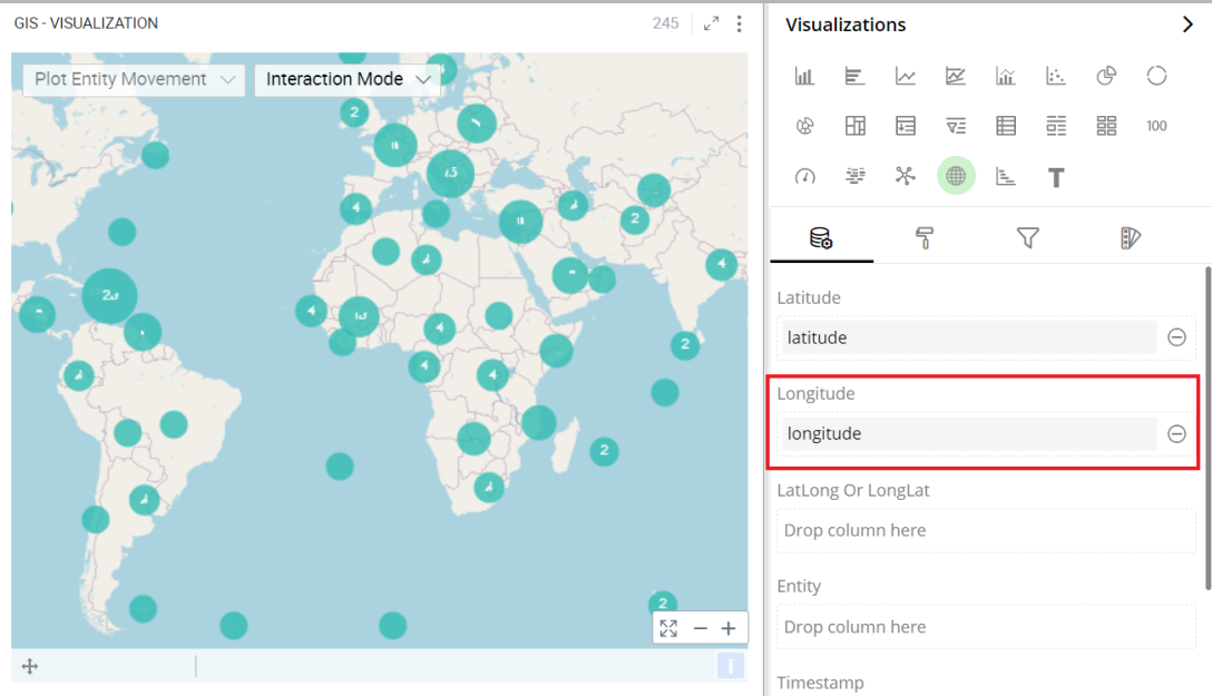
Longitude
Here, you can specify the column to be displayed as Longitude in GIS.
To change the column:
Click on the
icon to remove the existing column.Drag the desired column from the Data Panel and drop it onto the Visualizations Panel’s “Longitude” section.
Note: You can also type the column name in the Data Panel to quickly find it.
Visual Configuration
- Click the icon for visual configuration settings.
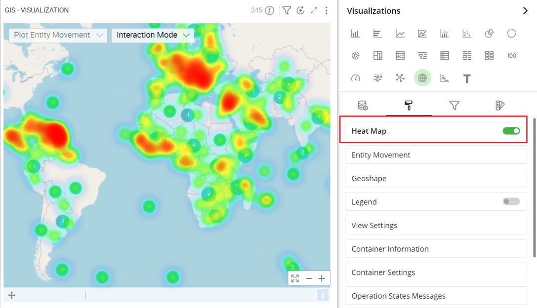
Heat Map
Heat Map lets you customize the representation of data in which values are represented by colors.
- To turn Heat Map on or off, select the toggle switch next to Heat Map.
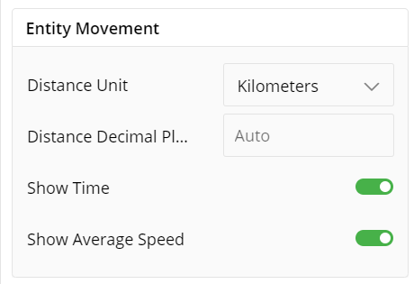
Entity Movement
Entity Movement stimulates movement of individual entities on a map.We can denote an movement of an entity from Distance Unit, Time Average Speed, etc.
Legend
Legend helps you identify and correlate data on your chart. They provide an overview of the different data points on the chart along with the associated colors.
To turn legends on or off, select the toggle switch next to Legend.
Select legend position (Left, Right).
Enter the text to change the legend heading.
Move the slider or provide the value for font size and Max Width in %.
Click on the color and select a Font color from the color grid. To restore the default color setting, click ‘Reset to Default’.
To turn Word Wrap on or off, select the toggle switch.
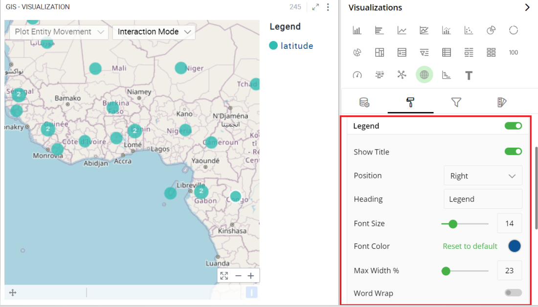
Note: Click on legend items and related data will be highlighted in the visualization.
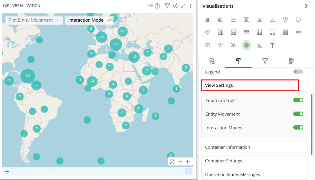
View Settings
View Settings helps you view and explore the data on your GIS chart. To turn the Zoom Controls, Entity Movements, and Interaction Modes on of off, select the toggle switch.
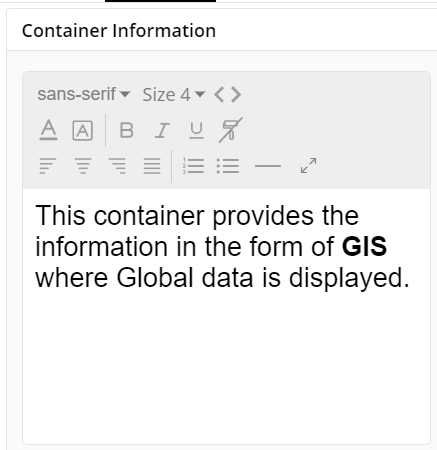
Container Information
- You can enter the details of a container in the Container information and change its Font, Size, Color, etc.
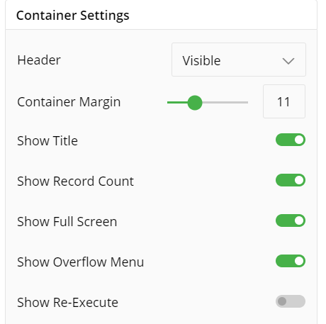
Container Settings
- Change the container Settings for the following fields such as Header, Container Margin, Container Margin, etc. as per your requirements.
The following figure displays the effect of various settings for GIS.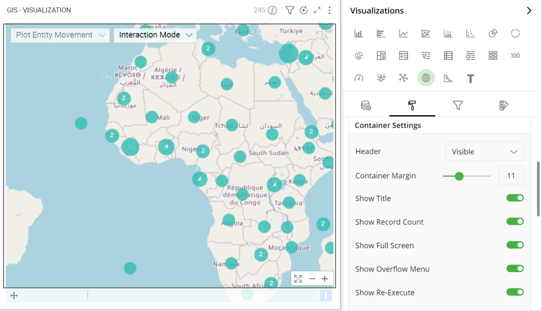
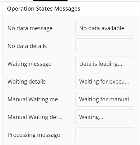
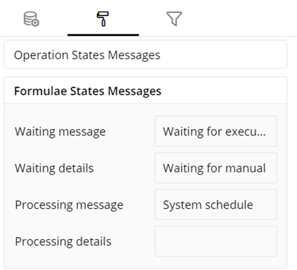
Operation States Messages
- Add/edit the Operation States Messages such as Waiting message, Waiting details, Processing message, etc. to provide a concise information about operation states.
Formulae States Messages
Add/edit the States Messages such as Waiting message, Waiting details, Processing message, etc. to provide a concise information about Formulae states.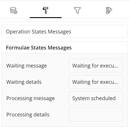
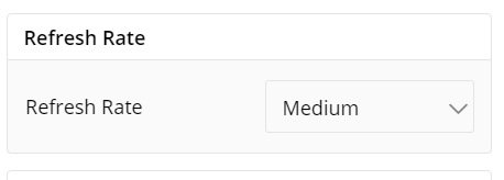
Refresh Rate
- Change the Refresh Rate such as Low, Medium, High resolution to display updates in your application.
Visual Interactions
- Select the target behavior and coordinated visualization scope from the settings, as shown below:
To learn more, refer to section- ‘Configure Coordinated Visualization’.
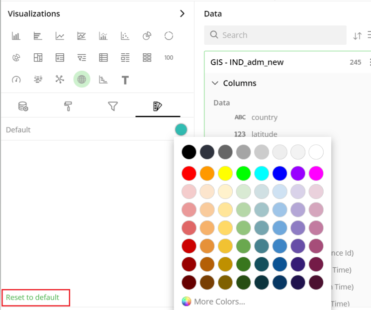
User-Defined Colors
- Click on the
 icon for user-defined color settings.
Colors for Individual Data Item
It lets you add meaning to a data item by associating a specific color to it and differentiate some data items from the rest.
For example, the red and green color may be used to represent “Off Track” and “On Track” issues, respectively. Whereas, orange color may be used for the “Bugs” type of issues to draw attention.
To change the colors:
Click on the color picker next to the data item for which you want to change the color.
Select the color from the available color grid or click ‘More Colors’.
To restore default settings, click on ‘Reset to default’.
Configuration Options in Full-Screen Mode
Visualization can be seen in full-screen mode by clicking on the  icon.
icon.
Note: Visualizations Panel is not accessible in full-screen mode.
- Click on the
 icon at the top-right corner of the container.
Select ‘Configure View’ the overflow menu.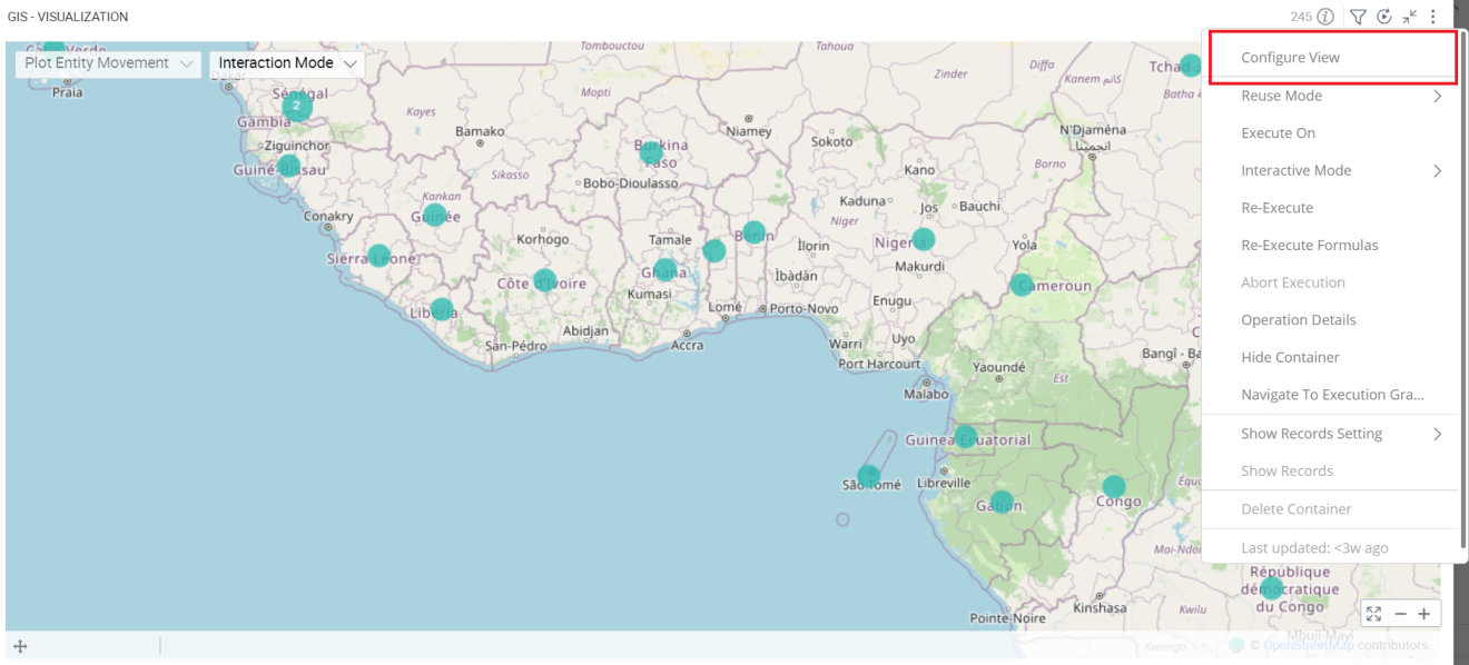
A pop-up form with all the relevant configuration options will appear on the screen.
Configure your Visualizations and click on ‘Apply’.
If you have any feedback on Gathr documentation, please email us!